Eye-Catching Layout
In the age of digital media, print design continues to captivate audiences with its tangible and immersive qualities. Whether it’s brochures, flyers, business cards, or posters, well-executed print designs have the power to leave a lasting impression on viewers. In this blog, we will explore the art of print design and share top tips for creating an eye-catching layout that effectively communicates your message. From understanding the principles of design to selecting the right colors and typography, mastering the art of print design will elevate your marketing materials and engage your target audience.
Embrace Design Principles
 Balance
 Balance
Achieve visual harmony by distributing elements evenly within your layout. Balance can be symmetrical, where elements are mirrored on either side of a central axis, or asymmetrical, where elements of varying sizes and visual weight create a sense of equilibrium.
Contrast
Use contrast to make important elements stand out. Contrast can be achieved through differences in color, size, shape, or texture. By juxtaposing elements with contrasting characteristics, you create visual interest and guide the viewer’s attention.
Alignment
To guarantee an eye-catching layout, you must ensure that your elements are aligned properly. Alignment creates a sense of order and makes the design more visually appealing. Pay attention to the alignment of text, images, and other graphic elements.
Repetition
Repetition helps establish visual consistency and strengthens the overall design. Use consistent colors, fonts, and styles throughout your layout to create a cohesive and unified look. Repetition also aids in reinforcing key messages and branding elements.
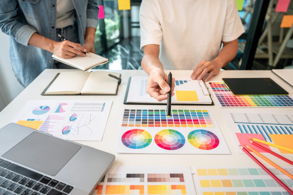
Choose Colors Wisely
Consider Branding
Select colors that align with your brand identity and evoke the desired emotions. Use your brand’s primary colors and complementary shades to maintain consistency and reinforce brand recognition.
Understand Color Psychology
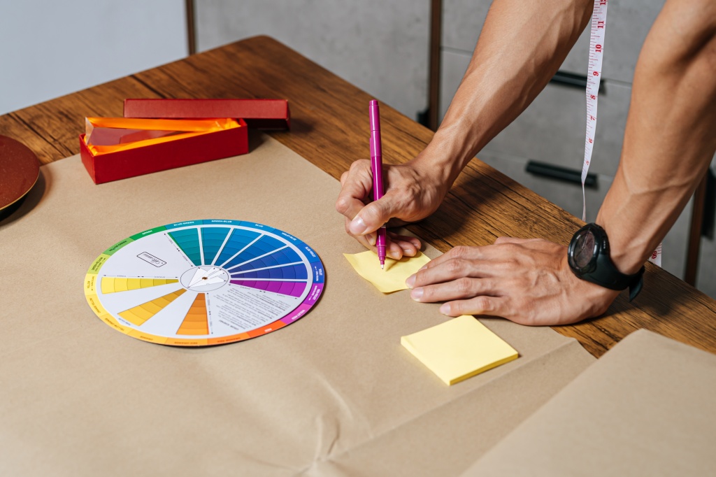 Understand Color Psychology
Different colors evoke different emotions and have varying cultural associations. Consider the psychological impact of colors when designing your print materials. For example, warm colors like red and orange can convey energy and excitement, while cool colors like blue and green evoke calmness and trust.
Use Color Contrast
Ensure sufficient contrast between text and background colors to ensure readability. High contrast enhances legibility and makes key information stand out.
Typography Matters
Font Selection
Choose fonts that complement your brand image and reflect the tone of your message. Serif fonts, with their small decorative strokes, often convey a traditional or formal feel, while sans-serif fonts appear modern and clean. Experiment with different font combinations to create hierarchy and visual interest for a truly eye-catching layout.
Hierarchy and Readability
Establish a clear hierarchy by using different font sizes, weights, and styles. Prioritize important information and guide the reader’s eye through deliberate font choices. Ensure readability by using appropriate font sizes and selecting legible typefaces.
White Space
Don’t underestimate the power of white space or negative space. Give your design room to breathe by strategically incorporating white space around elements. White space helps create visual balance, enhances readability, and draws attention to key elements.
Use High-Quality Images
Resolution and Clarity
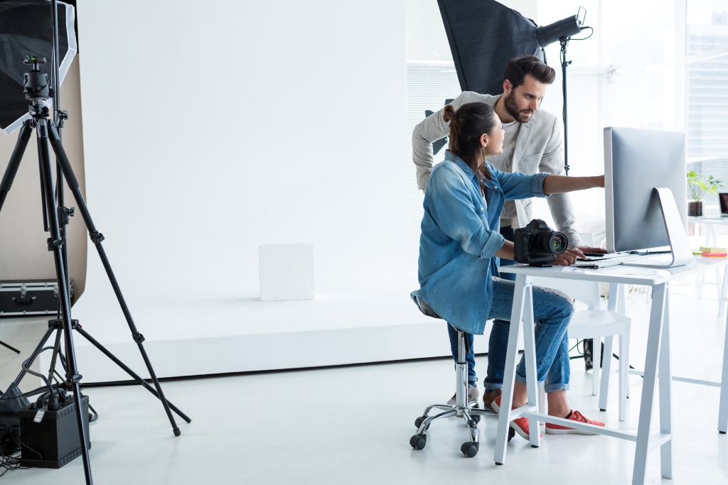 Resolution and Clarity
Ensure that any images you use are high-resolution and crisp. Low-resolution images can appear pixelated and detract from the overall quality of your design. Invest in high-quality images that accurately represent your brand and message.
Consistent Style
Maintain a consistent visual style throughout your design by selecting images that align with your brand’s aesthetic. Whether it’s photography, illustrations, or graphics, ensure that the images you choose reinforce your intended message and create visual harmony.
Release Your Eye-Catching Layout to the World
Mastering the art of print design requires a thoughtful and strategic approach. By embracing design principles, selecting appropriate colors and typography, using high-quality images, and paying attention to print details, you can create an eye-catching layout that captivates your audience and effectively communicates your message. Keep experimenting, stay updated with design trends, and remember that print design offers a unique opportunity to engage your audience through its tangible and immersive nature. As a printing company in Savannah, we are here to support your print design journey and bring your vision to life with precision and creativity.
")
Check out our other recent blogs:
The Restaurant Printing Playbook: Menus, Window Graphics, and Delivery Vehicle Wraps That Drive Orders
Drive more restaurant orders with strategic menus, window graphics, and delivery vehicle wraps that boost visibility, build your brand, and turn hungry customers into loyal regulars.

Fleet Vehicle Wraps: Rolling ROI for Brand Recognition & Trust Building
When properly designed, your fleet vehicle wraps become a moving billboard that delivers your message around town day in and day out.

The Hidden Metrics That Actually Build Customer Loyalty
As businesses look to build lasting customer relationships—not just generate one-time clicks—it’s important to understand the difference between campaign-level measurement and relationship-level tracking.