Color Contrast in Print Design
In the world of design, color isn’t just a visual element; it’s a powerful tool that can convey emotions, evoke reactions, and communicate messages. One of the key principles in effective design is color contrast. When used skillfully, it can make your message stand out and leave a lasting impression on your audience. In this blog, we’ll explore the art of color contrast in print design and how to apply it effectively in various mediums, from posters and vehicle wraps to business cards and more.

Understanding the Impact of Color
Colors have a psychological impact on viewers. They can evoke emotions, convey meaning, and even influence decision-making. For instance, warm colors like reds and oranges tend to evoke energy and passion, while cooler colors like blues and greens often create a sense of calm and trust. Understanding the psychological effects of colors is the first step in effectively using color contrast in print design.
The Role of Contrast
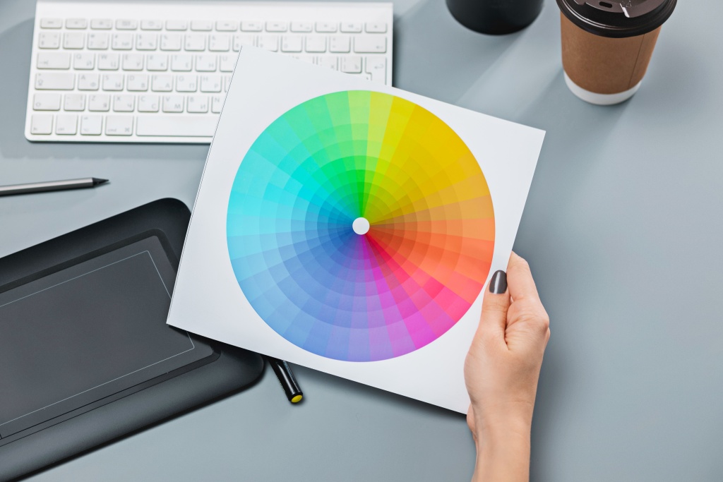
Contrast is about creating visual interest and making elements stand out. It involves using colors that are different from one another in a way that enhances readability and draws attention to specific areas of your design. High contrast combinations, like black and white, are often used for maximum visibility, but other combinations can be equally effective when used strategically.
The best way to find contrasting colors for print design is to use a color wheel. Any two colors that are opposite each other on a color wheel will provide a pleasing contrast when used together.
Designing for Print: Tips for Eye-Catching Results
When designing for print, it’s crucial to consider how colors will appear in the final product. Here are some tips for achieving eye-catching results:
CMYK vs. RGB
Understand the difference between CMYK (used for print) and RGB (used for screens). Ensure your design is in CMYK mode to get accurate color representation in print.
Consider Paper Stock
The type of paper you choose can affect how colors appear. Matte and glossy papers reflect light differently, which can impact color vibrancy.
Test Color Combinations
Print a small test run before finalizing a large print order. This allows you to see how colors look on the actual paper stock.
Design Mediums and Color Contrast
 Posters
 Posters
Posters are a versatile medium for conveying messages. When designing a poster, consider the following:
- Bold Color Choices: Use vibrant, attention-grabbing colors to draw viewers in.
- Hierarchy of Information: Apply color contrast to prioritize key information, making it easily digestible.
Stickers
Stickers are often seen in passing, so they need to be instantly eye-catching:
- Contrast for Readability: Ensure that text contrasts with the background for easy reading.
- Playful Color Schemes: Depending on the audience, bright and playful colors can make stickers more appealing.
Vehicle Wraps or Decals
Vehicle wraps are like moving billboards. Consider these tips:
- High Contrast for Visibility: Ensure that text and graphics are highly contrasting for maximum visibility from a distance.
- Consider the Environment: Think about the colors of the places where the vehicle will be seen and choose complementary or contrasting colors accordingly.
Banners
Banners are often viewed from a distance, so high contrast is key:
- Simplicity is Key: Use a limited color palette to avoid overwhelming the viewer from a distance.
- Test for Visibility: View your design from various distances to ensure it remains clear and readable.
Business Cards
Business cards are a direct representation of your brand. Here’s how to make them stand out:
- Branded Color Palette: Use your brand’s established color palette to maintain consistency.
- Emphasize Key Information: Apply contrast to ensure essential details like your name and contact information are easily noticeable.
Color contrast in print design is a subtle yet powerful aspect that can significantly impact how your message is perceived. By understanding the psychological effects of colors, considering the medium, and implementing high contrast techniques, you can create designs that effectively communicate your message and leave a memorable impression on your audience. So, embrace the art of color contrast, and let your message shine!
Check out our other recent blogs:
The Restaurant Printing Playbook: Menus, Window Graphics, and Delivery Vehicle Wraps That Drive Orders
Drive more restaurant orders with strategic menus, window graphics, and delivery vehicle wraps that boost visibility, build your brand, and turn hungry customers into loyal regulars.

Fleet Vehicle Wraps: Rolling ROI for Brand Recognition & Trust Building
When properly designed, your fleet vehicle wraps become a moving billboard that delivers your message around town day in and day out.

The Hidden Metrics That Actually Build Customer Loyalty
As businesses look to build lasting customer relationships—not just generate one-time clicks—it’s important to understand the difference between campaign-level measurement and relationship-level tracking.