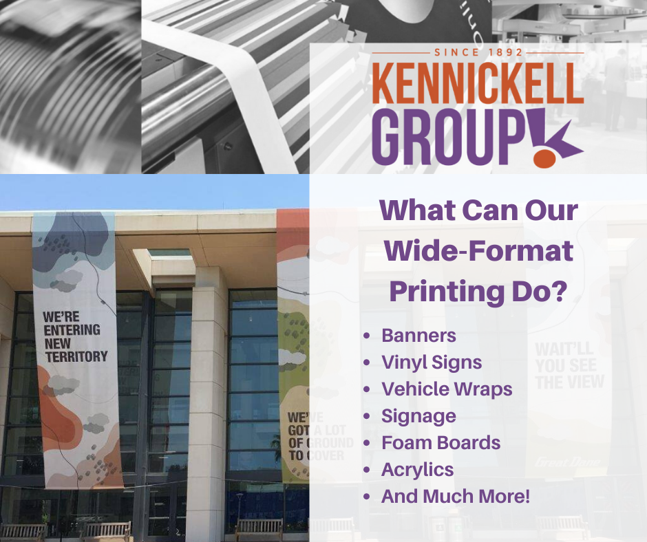
Top 5 Business Signage Tips for 2021
What should your signage do for your business?
The signs in your business are a visual representation of your products, your services, and your values. Signage should:
- Be eye-catching
- Present the customer’s options clearly
- Help your customer understand the core principals of your product
Let’s get into it: Top 5 Business Signage Tips
In general, the design of your signage will depend on the purpose of the sign. So for this article we’ll be looking at two different categories – indoor signage (things like large menus or signs displaying specials) and outdoor signage (things like advertisements or signs to go on the front of your location to attract customers in).
Indoor Signage
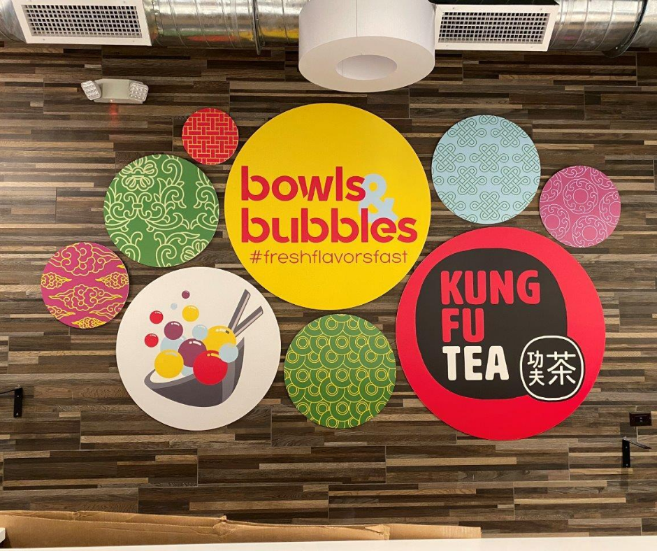
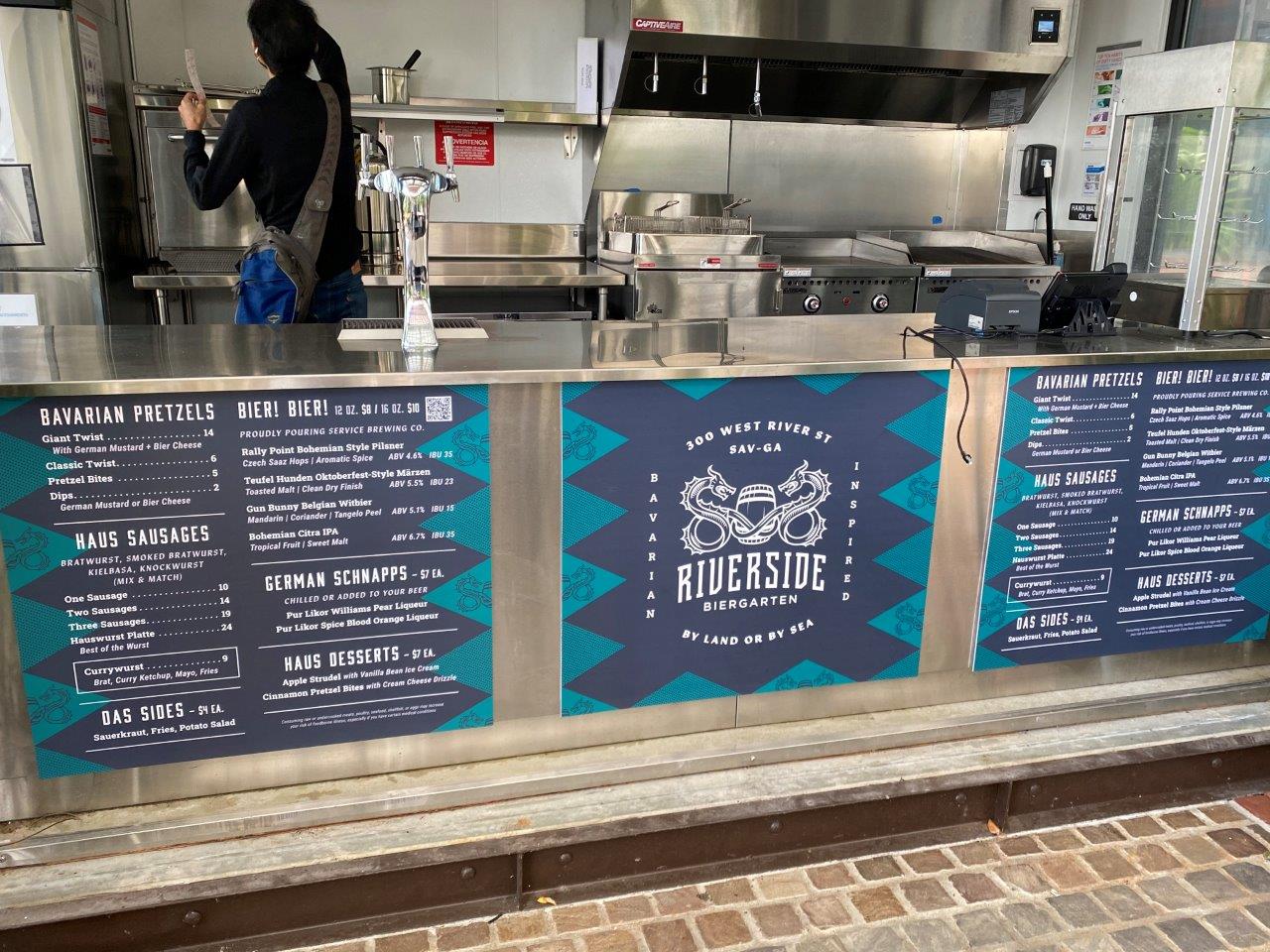
Let’s talk colors. The human brain registers colors before anything else when we first lay eyes on a sign. You want yours to be eye-catching, but not overwhelming. A good way to do this is by using contrasting colors (a dark background with lighter letters is always a great combination), but not too many colors. Having a bunch of different colors can distract and take away from readability, so it’s better to stick with just a few well-contrasted colors.
You’ll also want to make sure the colors you’re using match your brand’s identity – try incorporating one or two colors from your logo for a pop, or at least staying within the same color family for your indoor signage. Is your logo bright? Muted and pastel? Do you use a lot of warm tones in your brand design? Try to keep the theme uniform across all your signage.
Avoiding a Font Fiasco. Font is the second most important thing to consider when designing a sign. This area can be a little overwhelming, since there are seemingly infinite choices and almost everyone has a different opinion on which choice is the best. But if you stick to a few core principles, you can get through this portion of the design. Most obviously, avoid anything too complicated. You want your sign to be easily readable, and complicated fonts can disrupt the entire flow of the sign. If you do want maybe one small portion of the sign in a more complicated font (say, you have a signature font that your logo is in and you’d like that font to appear on your menu as well), make sure you get it in front of a lot of people and verify that they can easily read it before finalizing the design.
A good rule of thumb is to never use more than two fonts in a single design. Other things to consider will be your colors. Does your font choice match the feel of your color choice? Get a few different people’s opinion on this if you aren’t sure! Some design schools of thought also hold that using all capital letters makes a sign easier to read – this isn’t necessarily true, but if you like the look of using all capital letters, do it!
Be Bold! A simple, bold design will always be more attractive than a cluttered one. Bold, descriptive designs project confidence, especially in signs that are displaying specials or new products. This means fewer words, higher contrast, and impactful graphics.
Outdoor Signage
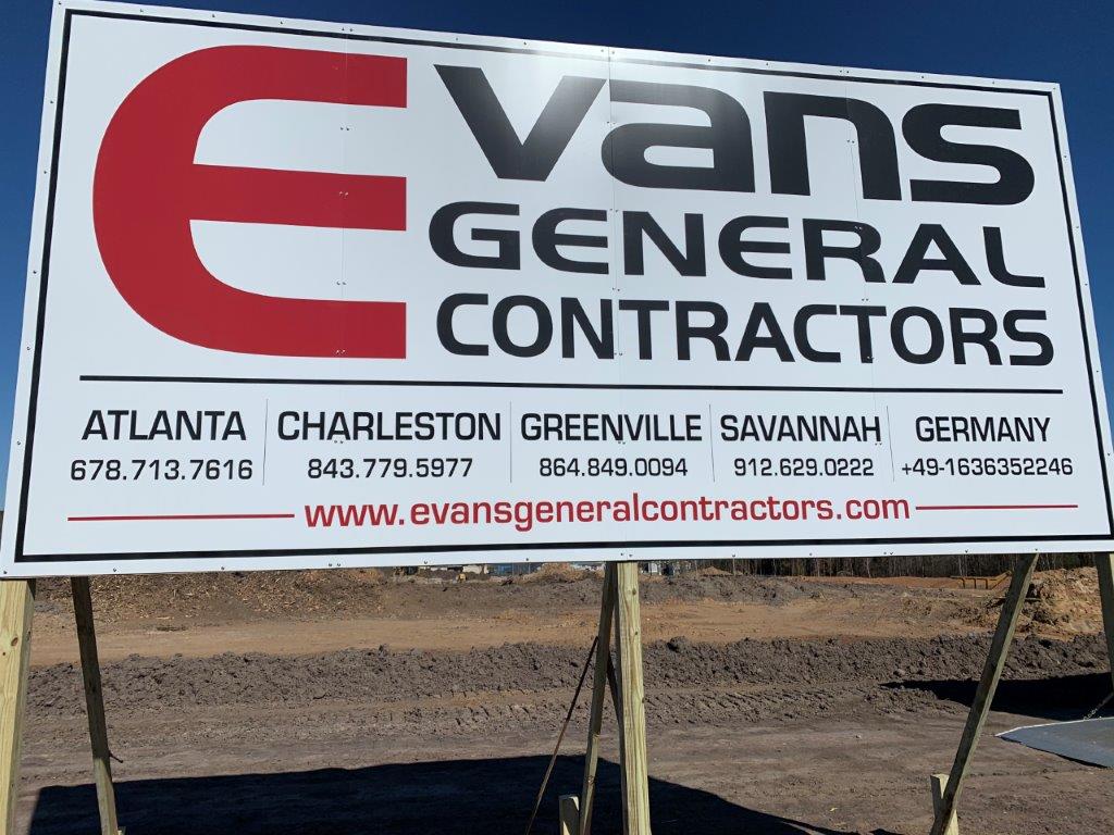
Keep it simple. White space is your friend! Having limited content with bold contrasts is much easier for passing customers to read and understand quickly, which means they are more likely to take what you’re saying into consideration. A cluttered sign is often overlooked.
Consider speed. If you’re placing a sign outdoors, hoping to attract passing customers, you need to consider that a lot of those customers will be passing by in cars. Someone driving by in a car has a fraction of the time to see and register your sign compared to pedestrians. For this reason, make sure you’re thinking about who you want to appeal to with your sign, and how fast they’ll be going by. This will greatly affect how much content you want to put on your sign, and how large the text and images might need to be.
Location, location, location! For outdoor signage to be effective, it needs to be easily visible! One of the most basic business signage tips is to take into consideration the traffic around your location and any obstructions that may need to be avoided when placing your sign. Make sure your sign is facing the flow of traffic, and that from the road there are no obstructions covering parts of your sign that may be important.
Ready to take your signage to the next level?
Call us or fill out a contact form to get started designing and printing your business’s newest assets.
Check out our other info on business signage:
Wall Graphics and Event Signage for Your Business
Outdoor Signage and Your Business